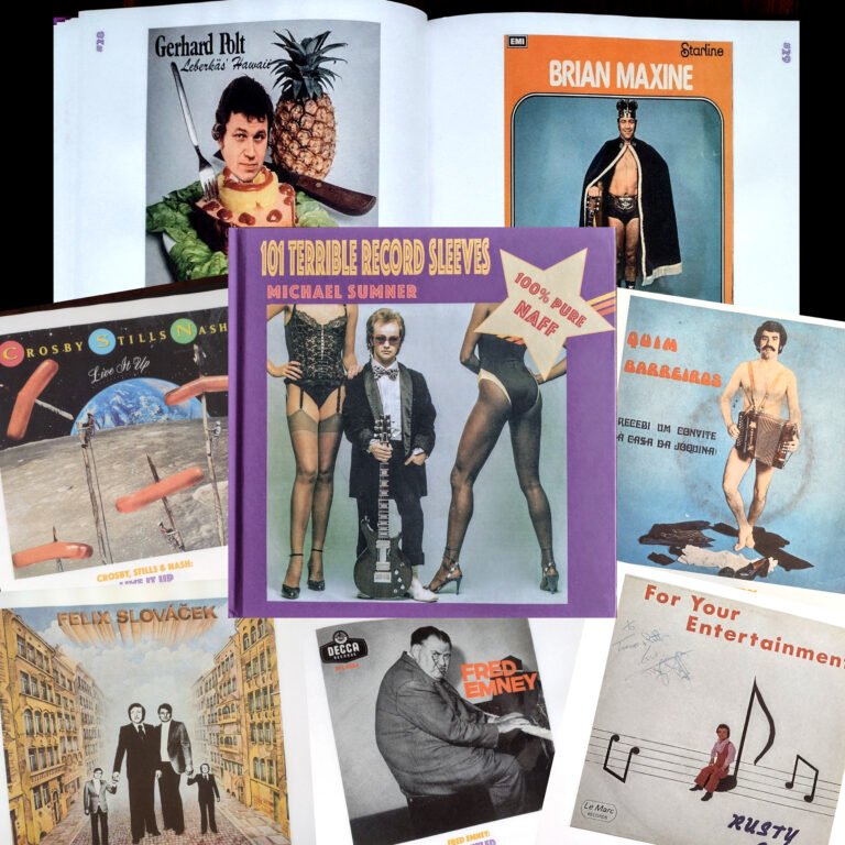


The Hall of Shame
In contrast to my last post – Gatefold Galleries – and in light of Michael Sumner’s hilariously horrific book ‘101 Terrible Record Sleeves’, this post is a celebration of bad album covers, as opposed to good ones.
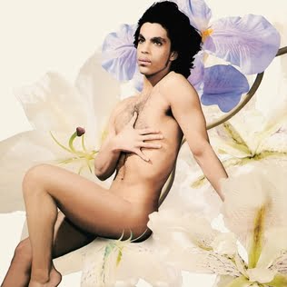

I love a good album cover but as a rule I don’t really like portrait sleeves. I think the bands or artists are just asking for trouble by putting themselves in the spotlight like that. The Beatles and Bowie usually got away with it by coming up with a different twist on the portrait, and because they were more photogenic than most. But even for the more camera-friendly artists it can go wrong – step forward Prince and Michael Jackson. Prince was no stranger to bold portraits (Prince, Dirty Mind), but he attempted a creative and controversial curveball with ‘Lovesexy’, a brave sleeve, especially for someone who was enjoying a commercial peak at the time, but that’s perhaps the most positive thing I can say about it. As for Michael Jackson and ‘Thriller’, picking such a cliched pose for one of the biggest selling albums of all time was surely irresponsible considering how many homes it has graced over the years. On a similar note, ‘Songs From The Big Chair’ has always niggled. Apparently, Tears For Fears were originally going to opt for a sparse but simple image of a therapists chair, in keeping with both the theme of the album and the minimalism they had adopted for the sleeve of their classic debut, ‘The Hurting’. But instead of that they effectively chose to go with a tribute to Simon & Garfunkel’s ‘Bookends’, only one that screams 1980’s every time you look at it.
That’s just one opinion though, of course. Some people will love the aforementioned covers. The truth is, as much as I might have a dislike for them and their ilk, they’re still not that terrible. No, for a record sleeve to belong in an artwork Hall of Shame it has to be unintentionally, undeniably, and inexplicably dreadful.
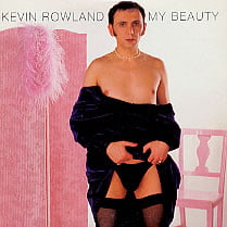
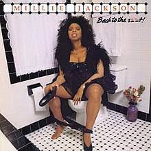
One of the best things about ‘101 Terrible Record Sleeves’ is that in the course of his global crate-digging expeditions Michael has unearthed covers that don’t often feature in bad cover art rundowns, many of which people won’t have seen before but really are deserving of a wider audience. As the book illustrates, portrait covers dominate in the field of bad sleeve design. In particular there is a sub-genre of concept portraits in which the artist’s image, or part thereof, has either been superimposed on a scene – great examples being Gerhard Polt, Kjell Kraghe and Terre Thaemlitz, or they’ve been compelled to dress up & pose in some bizarre scenario – Wild Oates & Udo Lindenberg, for example. Two classics of that particular genre that aren’t featured are Kevin Rowland’s ‘My Beauty’ and Millie Jackson’s ‘Back to the Shit’. In the case of both the image says it all, which is just as well because words fail.
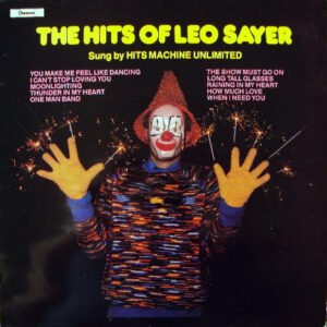
One of my personal ‘favourites’ – and one that isn’t included in the book – has long been ‘The Hits of Leo Sayer’, to the point where when I came across a copy in a charity shop not so long ago, I reacted as if I’d just found an original copy of ‘Just Another Diamond Day’. The reason I like it is that it’s wrong on several levels. Firstly, and I apologise Leo Sayer fans, it’s the title. Secondly, it’s the fact that the ‘hits’ on the album are sung by someone else, and not just that but that they call themselves Hits Machine Unlimited. But more than any of that is the cover image itself. For a start, who or what is that? And who could have imagined such a thing? It doesn’t strike me as a good selling point to stick a clown on the front of an album, let alone one that has sparklers embedded in its fingers, whilst wearing rubber gloves, a jumper knitted by its Mum and a hat more befitting of a garden gnome. It really is the stuff of nightmares. But it’s the fact that it is so terrible, and encourages such a strong response, that in a strange way makes it quite good.
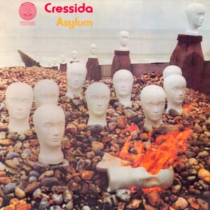
Sometimes a sleeve image might not be the best, but the idea should be applauded. Cressida’s second album, ‘Asylum’ (1971) being a case in point. There is certainly something surreal and vaguely unsettling about the image of disembodied showroom dummy heads scattered on a beach, one of which is on fire. The execution maybe wasn’t quite there so it doesn’t quite work, but that can be forgiven thanks to its Doctor Who ‘wobbly sets’ style charm.
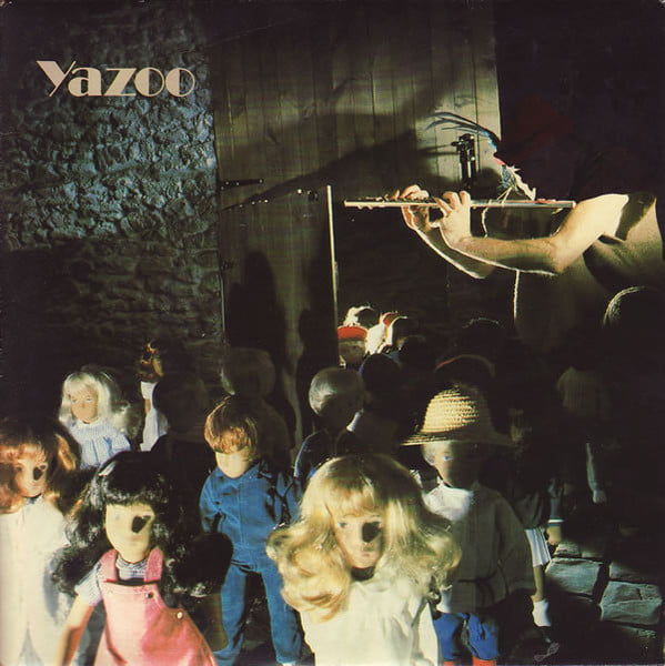
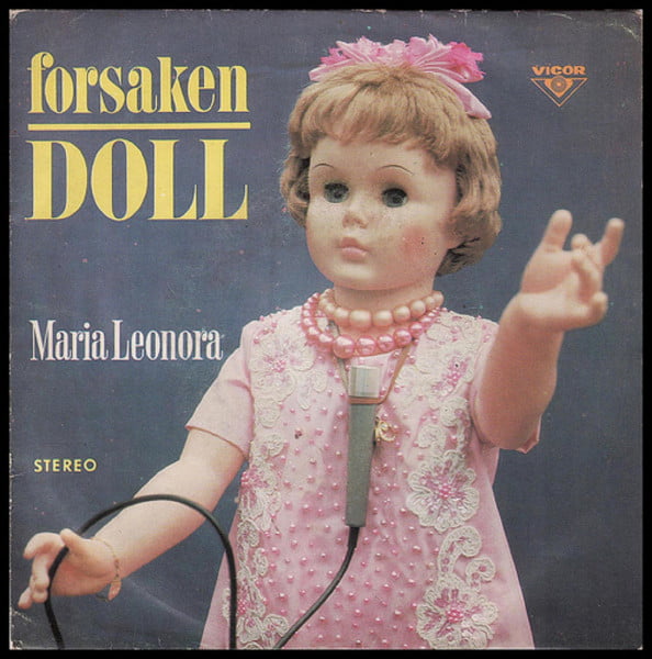
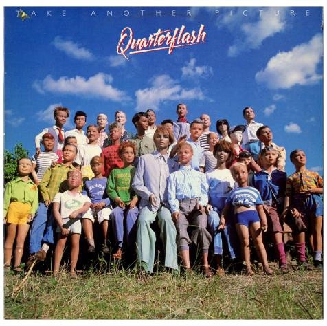
For a cover to be considered ‘bad’ it doesn’t always mean it has to be laughably poor – it could also be the stuff of nightmares. Dummy’s, dolls & mannequins will always send shivers down the spine, and can truly put the ‘dread’ in dreadful. With Yazoo’s ‘Don’t Go’, the image of the dolls being lead through a door by a pied piper character is creepy, but not nearly as creepy as the doll that adorns the cover of the deceptively cheery ‘Forsaken Doll’ by Maria Leonora. Then again, neither of them is as chilling as the assemblage of demonic mannequins on ‘Take a Different Picture’ by Quarterflash – the nightmarish jewel in the crown of Michael Sumner’s book.
Sleep well…